
Steel Display Fixture Pantone Consistency: Buyer Review
Steel Display Fixture Pantone Consistency: Buyer Review

Pantone color consistency in a steel display fixture is not achieved by sending one Pantone number to a powder coater. It is a cross-material approval system: the steel substrate, primer, topcoat, gloss level, lighting conditions and master sample must agree before assembly. For buyers at the decision stage, the practical question is not whether a supplier can spray a color, but whether powder-coated metal, lacquered wood and acrylic components can be approved against one visible standard and reproduced across the order.
That distinction matters for steel furniture buyers because color complaints often appear after the fixture is assembled, when mismatched panels, shelves and trim are seen together under retail lighting. A supplier’s color process should therefore be reviewed as a production control, not as a single color chip. This buyer review examines the documented decision points: finish choice, multi-material matching, pre-treatment, coating inspection, packaging and acceptance checks. The evidence base is supplier process content and comparison data; it does not represent a laboratory test report or an independent certification of any supplier.
This review is anchored in steel display fixtures. Buyers sourcing adjacent steel furniture categories, including steel bed frames, can reuse the same finish-approval logic when a Pantone match is specified, but the process evidence in this article relates to display fixtures; it does not establish bed-frame load, coating or compliance performance.
What buyers are actually approving when they specify a Pantone color
A Pantone reference defines a target color impression, not a complete production specification. On a steel display fixture, the visible result is shaped by the metal surface, the primer system, the powder or liquid coating, the gloss level and the light in which the fixture is viewed. The same Pantone number can look different on a matte powder-coated steel panel, a lacquered wood shelf and an acrylic display block because those materials absorb, reflect and scatter light differently.
The buyer’s approval should therefore identify three things in writing: the target Pantone number, the approved gloss level and the master sample used for comparison. The process evidence recommends a unified color-matching master sample and verification under multiple lighting conditions before mass production. It also recommends 100% color comparison against the approved master sample before assembly. For a buyer, this means the approval is not complete when a color chip is signed; it is complete when the supplier can show how every material and every batch will be checked against the same physical reference.
The finish decision: matte powder coating versus high-gloss baked enamel
For functional retail environments, matte powder coating is generally more suitable than high-gloss baked enamel when hiding surface imperfections and resisting fingerprints are priorities. High-gloss finishes are better suited to decorative applications that require vibrant color and a premium visual effect. The trade-off is maintenance and inspection visibility: high-gloss surfaces are prone to showing dust, fingerprints and minor scratches, while matte powder coating provides an understated texture, greater scratch resistance and easier maintenance.
Cost and lighting also change the decision. The comparison data states that high-gloss paint surfaces require repeated manual sanding and polishing, resulting in costs approximately 30%-40% higher than standard spraying. It also states that, under intense shopping-mall lighting, surface imperfections on high-gloss finishes can be magnified by up to 90%. Those figures are comparison-unit evidence, not a universal quotation rule, but they explain why a high-gloss Pantone match can be more demanding to approve and more expensive to maintain in a high-traffic store.
| Decision point | Matte powder coating | High-gloss baked enamel |
|---|---|---|
| Best fit | Functional environments where fingerprints, minor surface variation and high traffic are concerns. | Decorative applications requiring vibrant color and a high-gloss visual effect. |
| Surface behavior | Hides surface imperfections and resists fingerprints more effectively. | Shows dust, fingerprints and minor scratches more readily. |
| Cost signal | Standard spraying process; comparison should be based on the same size and quantity. | Repeated manual sanding and polishing can add roughly 30%-40% versus standard spraying. |
| Lighting risk | Lower visual magnification of minor defects. | Mall lighting can magnify surface imperfections by up to 90%, according to comparison data. |
The decision rule is straightforward: if the fixture must survive daily retail contact and the Pantone match is being applied across several materials, matte or semi-matte finishing reduces the number of visual variables. If the brand requires a high-gloss statement piece, the buyer should expect a stricter approval process and should confirm the acceptance standard under the actual store lighting before production.
Why multi-material display racks fail Pantone approval
Display racks that combine powder-coated metal, lacquered woodwork and acrylic components are the hardest common case for Pantone consistency. The materials do not absorb or reflect coatings in the same way, so a single topcoat color is not enough. The recommended process is to confirm the target Pantone color number and require suppliers to develop color-matched primer formulas separately for metal, wood and acrylic substrates. The finishing standard should then use a full-matte or semi-matte finish across all components, with one unified gloss standard.
This sequence matters because gloss differences can read as color differences. A high-gloss metal panel and a matte wood shelf may carry the same Pantone code but appear mismatched under directional light. By unifying the gloss standard and using substrate-specific primers, the supplier reduces the chance that the buyer will reject the assembled fixture for a color discrepancy that began in material preparation. The buyer should ask for the master sample to be checked under multiple lighting conditions, not only in an office or under a single lamp.
The final control is a 100% color comparison against the approved master sample before assembly. That is a production discipline, not a marketing claim. If a supplier cannot describe who performs the comparison, what light source is used and what happens to a failed component, the buyer has not yet verified the color-control system.
Pre-treatment: the invisible variable buyers should audit
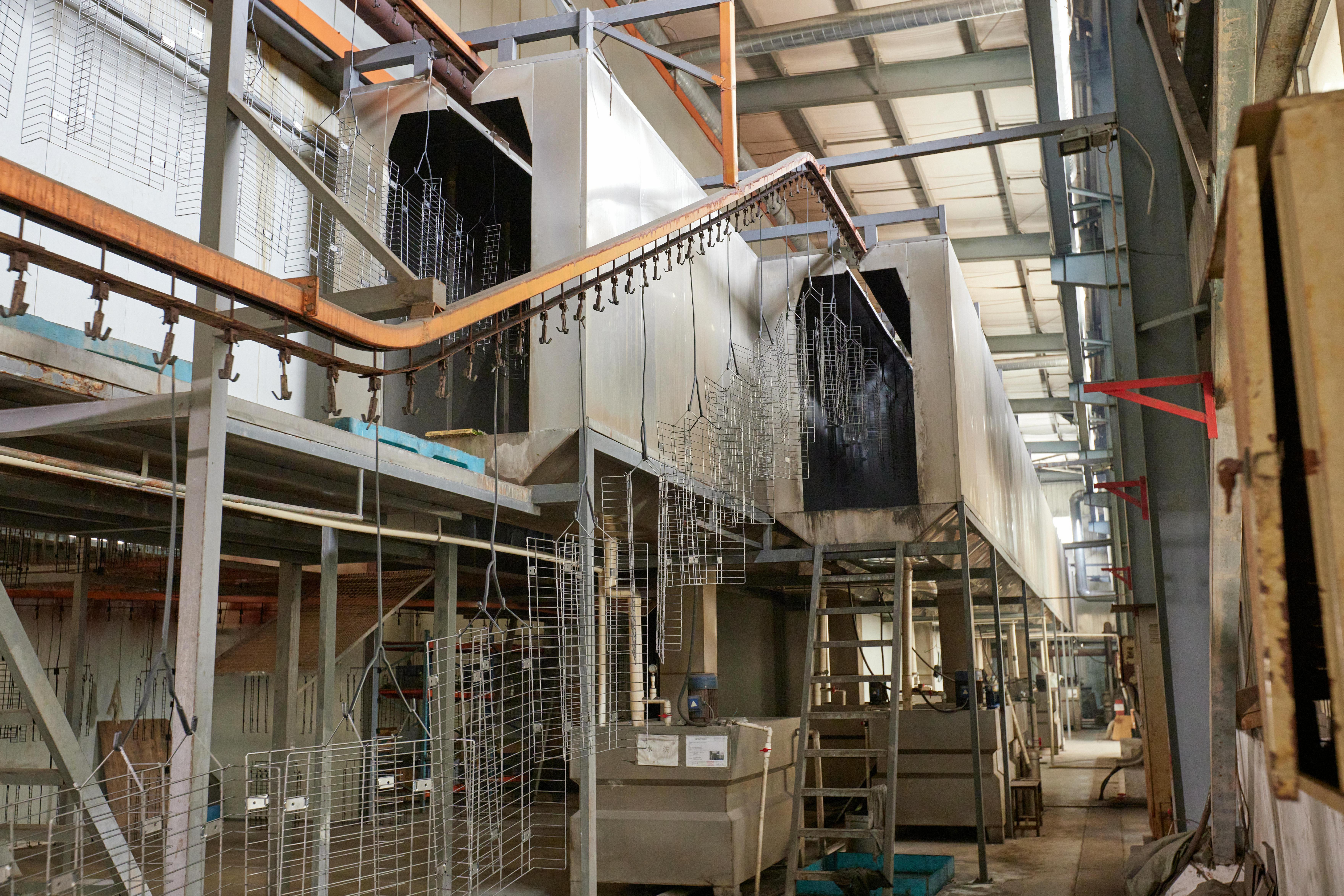
Coating adhesion and long-term appearance depend on what happens before the powder is sprayed. In humid coastal retail environments, visible color can be lost when the coating blisters or flakes because the iron surface was not properly prepared. The documented pre-treatment sequence includes full degreasing and rust removal, verification of surface cleanliness with a 30-second continuous water film test, ceramic conversion treatment to form a dense and uniform conversion film, and inspection before the workpiece moves to powder spraying.
The reason to audit this step is that pre-treatment is difficult to see in a finished fixture. If ceramic conversion is omitted, grease and microscopic rust on the iron surface can cause the powder coating to blister and flake in humid air. A dense conversion film supports long-term corrosion protection. Buyers reviewing a coastal store rollout should therefore ask for the pre-treatment steps, the water-film test result and the inspection record, not only the final color chip.
Coating defects: orange peel and missed spray
Two common coating defects can undermine a Pantone approval even when the color formula is correct. Orange peel is caused by excessive coating viscosity or improper spraying pressure. Missed spray results from uncovered dead angles. A buyer’s inspection standard should therefore include both color and surface quality, because a visible texture or an uncoated corner can make an approved color look wrong on the sales floor.
The documented inspection method is visual inspection under natural light at a distance of 1 meter, with the requirement that no obvious defects be visible to the naked eye. The process also calls for recording inspection results, marking unqualified products and feeding defect causes back to the spraying team for process adjustment. For the buyer, this suggests a practical acceptance question: what defect categories are written into the inspection record, and who signs off before packing? Color approval without a defect-acceptance standard leaves too much room for dispute.
Packaging and color arrival: full wrap versus partial protection
A color-approved fixture can still arrive with a damaged finish. Full wrapping is intended to eliminate paint-surface abrasion in high-humidity sea freight, while partial protection with bubble wrap and paper corner protectors is cost-effective but more susceptible to edge and corner damage during rough handling. The comparison data states that full-coverage packaging increases cost by approximately 5%-15%, but reduces the damage rate in cross-border shipping, such as FedEx direct delivery, from 8% to below 0.5%.
That trade-off should be matched to the finish and the route. Full wrapping is more suitable for high-gloss or matte painted parts, high-value display props and drop-shippable items required to withstand multiple transshipments. Partial protection may fit rugged warehouse iron racks or hot-dip galvanized anti-collision parts where cosmetic damage is less critical. For a Pantone-critical retail fixture, the packaging decision is part of color consistency because a scuffed edge or abraded panel will not pass the same visual standard as an intact surface.
Structural fit: do not let color approval hide load decisions
Color consistency is only one part of a display-fixture decision. Shelf construction affects load capacity, maintenance and long-term appearance. The comparison data states that a 25 mm MDF shelf with a 1-meter span has an ultimate load capacity of about 30 kg, while a 1.2 mm folded sheet metal shelf over the same span can hold up to 80-100 kg without risk of sagging. Sheet metal shelves also require less maintenance than MDF shelves.
The buyer should not treat those figures as a universal specification for every shelf; span, fixing method, stiffeners and edge design still matter. The useful decision rule is that a cost comparison between MDF and sheet metal shelves requires quotes based on the same size and quantity to determine the actual difference. A low unit price on a lighter shelf is not comparable to a heavier-duty shelf unless the load requirement and the visible finish standard are stated in the same brief.
Assembly and acceptance: when fit problems appear
When screw holes do not align or shelves cannot be inserted during assembly, the documented response is to stop assembly, check for obstructions or incorrect parts, and realign components before making connections. Connections should never be forced. This is a basic acceptance control, but it is relevant to color review because forced assembly can damage coated edges and create touch-up areas that no longer match the master sample.
For retail rollout teams, the practical lesson is to separate three approval gates: component color against the master sample, component surface quality against the inspection standard, and assembled fit against the installation drawing. Combining them into one final walk-through makes it harder to identify whether a visible mismatch came from coating, material batch or assembly damage.
Market context: why finish control is a sourcing question
A commercial research estimate published by Mordor Intelligence places the global metal furniture market at USD 193.83 billion in 2026 and USD 243.63 billion by 2031, a 4.68% CAGR. That figure covers metal furniture broadly, including steel, aluminum and other metals; it is not a steel-display-fixture-specific market size. The same source estimates that Asia-Pacific accounts for approximately 48% of the metal furniture market in 2026. China’s exports of HS 940320, other metal furniture, reached USD 11.1 billion in 2025, according to GACC and ChinaData.
Those figures are directional context for sourcing discussions, not proof of demand for any single supplier or finish system. Their buyer relevance is simpler: when a category is large and globally supplied, color consistency becomes a supplier-selection criterion rather than a cosmetic detail. A buyer comparing quotations should ask whether the quoted finish system includes substrate-specific primers, a unified gloss standard, a master sample and a pre-assembly color check. Without those controls, two quotes may look comparable on paper while carrying different color risk.
Where Qunyi Fixture fits the buyer review
Qunyi Fixture (Xiamen Qunyi Hardware Co., Ltd.) is a display-fixture manufacturer with an R&D center in Xiamen and main production in Zhangzhou. Its published company profile lists a 300,000-square-foot plant, 200 employees, five engineers and certification to ISO, BSCI and FSC. The same profile describes integrated work in metal, wood, glass and acrylic display fixtures, storage racks and store facilities, with a Xiamen sample room and export markets including the USA, Australasia and the EU.
That multi-material scope is relevant to the Pantone-consistency question because the approval problem usually appears at the junction of metal, wood and acrylic components. The company’s published product scope includes slatwall and gridwall panels, gondolas, endcaps, display tables, garment racks, bulk display baskets, showcases, risers, countertop displays and cash counters. For a buyer, the useful check is not the breadth of the catalogue alone, but whether the supplier can document the color-matching master sample, the substrate-specific primer approach and the pre-assembly comparison step for the specific fixture being quoted.
Qunyi Fixture also publishes a brochure for readers who need the company’s capability and product reference: Qunyi brochure.
Buyer decision checklist for Pantone-critical steel fixtures
- Confirm the target Pantone number, the approved gloss level and the physical master sample before quoting.
- Require substrate-specific primer formulas for powder-coated metal, lacquered wood and acrylic components.
- Unify the gloss standard across materials; full-matte or semi-matte finishing reduces visual mismatch risk.
- Verify the master sample under multiple lighting conditions, including the intended retail lighting.
- Ask for the pre-treatment sequence: degreasing, rust removal, 30-second water film test, ceramic conversion and pre-spray inspection.
- Write the coating-defect acceptance standard into the order, including the 1-meter natural-light visual check.
- Match packaging to the finish and route; full wrapping is more suitable for high-value painted parts and multiple transshipments.
- Keep structural load requirements separate from color approval, and compare shelf quotations on the same size and quantity basis.
- Stop assembly if holes or shelves do not align; realign instead of forcing connections that can damage coated surfaces.
FAQ
How should a buyer manage Pantone consistency across powder-coated metal, lacquered wood and acrylic in one display rack?
Confirm the target Pantone color number and require suppliers to develop color-matched primer formulas separately for metal, wood and acrylic substrates. Adopt a full-matte or semi-matte finish for all components and unify the gloss standard. Require a unified color-matching master sample, verify color consistency under multiple lighting conditions, and conduct a 100% color comparison against the approved master sample before assembly. Coating operations should also follow safety precautions for paint dust, solvent vapor and grounded painting equipment.
Is matte powder coating more suitable than high-gloss for high-traffic retail fixtures?
Matte powder coating is generally more suitable for functional environments where hiding surface imperfections and resisting fingerprints are priorities. High-gloss powder coating is suited to decorative applications that require vibrant color. High-gloss surfaces are more prone to showing dust, fingerprints and minor scratches, while matte powder coating offers an understated texture, greater scratch resistance and easier maintenance. The comparison data also states that high-gloss paint surfaces can cost approximately 30%-40% more than standard spraying because of repeated sanding and polishing.
Why does ceramic conversion pre-treatment matter for coastal retail projects?
Ceramic conversion is part of the pre-treatment sequence that supports coating adhesion and long-term corrosion protection. The documented steps include full degreasing and rust removal, verification with the 30-second continuous water film test, ceramic conversion to form a dense and uniform conversion film, and inspection before powder spraying. If ceramic conversion is omitted, grease and microscopic rust on the iron surface can cause the powder coating to blister and flake in humid air.
How are orange peel and missed spray judged during coating inspection?
Orange peel is caused by excessive coating viscosity or improper spraying pressure. Missed spray results from uncovered dead angles. The documented inspection method is to place the finished workpiece under natural light and conduct a visual inspection at a distance of 1 meter against the acceptance criteria, with no obvious defects visible to the naked eye. Inspection results should be recorded, unqualified products marked, and defect causes fed back to the spraying team for process adjustment.
What should store staff do if screw holes do not align or shelves cannot be inserted during assembly?
Assembly should stop. Staff should check for obstructions or incorrect parts and realign the components before making connections. Connections should never be forced. Forcing a connection can damage coated edges or create touch-up areas that no longer match the approved master sample.
Conclusion
Pantone consistency in steel display fixtures is a production-control decision, not a color-chip transaction. The buyer’s strongest protection is a written approval chain: one master sample, substrate-specific primers, a unified gloss standard, verified pre-treatment, a defined coating-defect inspection method and packaging that protects the finish in transit. Matte and high-gloss finishes can both be appropriate, but they carry different visual and maintenance risks. When the fixture combines metal, wood and acrylic, the supplier’s ability to control those variables before assembly is the difference between a repeatable retail rollout and a batch-by-batch color dispute.
Tem questões ou precisa de mais detalhes?
Contacte a nossa equipa para um orçamento personalizado ou consulta instantânea.
Solicitar orçamento
Preencha o formulário abaixo e a nossa equipa entrará em contacto com uma proposta personalizada.
Chat direto do WhatsApp
Prefere conversar em tempo real? Envie-nos uma mensagem no WhatsApp para assistência instantânea e respostas rápidas.
- Obter orçamento personalizado
- Partilhar fotos ou documentos
- Discuta as suas necessidades diretamente
Geralmente responde em 5–30 minutos durante o horário de expediente.